
When you ask someone what are your Favourite Colours? Most will mention Blue as one of them. Why is that? My reason is that we see the blue sky and are immediately happy. We associate blue sea with a happy time; perhaps when we were on holiday. Blue is everywhere. So obviously it is our favourite colour!
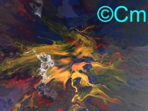
Looking back over our paintings – blue does seem to be the dominent colour in the vast majority of those completed. It must of been a subilimal reason! Recently, we have been completing nautical paintings using Windsor Blue for the sky mixed with Prussian Blue. Also a mixture of blues to produce a light blue or sometimes purple sea colour. So Blue has been on our minds.

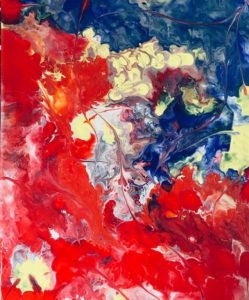
Mentioning Purple brings in the colour red, because blue mixed with a little red will produce a very nice purple. Add a little white to tint it and you have a nice sea colour! Red is one of the second favourite colours in a recent survey. Which is a bit unusual. Not many paintings have a lot of red in them. I once read that the Saudi Arabians liked Red in their chosen paintings – it must be to do with the lovely sunsets they experience in their country.
Green is another very popular colour mentioned in this recent survey. Again I can only assume it is because of the green fields, hedges and lawns we see each day. A lush green area of grass is lovely! Even that can have different tones of green that entice our feelings of enjoyment. Walking through trees on a windy summers day shortly after a shower of rain can really feel very enjoyable, as you look skyward to see the leaves swaying in the wind.
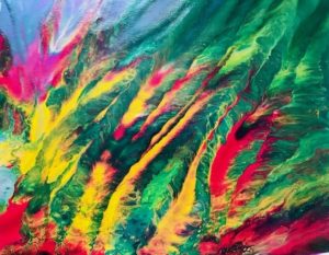
Recently, on Facebook I have noticed several friends post photos of lovely Orange sunsets. Orange was another colour mentioned in the survey as being popular. However, in a painting Orange normally only gets a fairly small area of the canvas. Perhaps because Artists are taught to only use Orange scarcely. Don’t over do it! You are taught! Which is a shame, because orange can really be attractive in a painting.
Which leads to another colour which doesn’t get much attention in paintings. Brown. Avoid Brown artist are taught. Mud. You will get mud if you mess up your painting! So you don’t see much Brown in modern day paintings. Orange can lead to Brown if you darken it too much.
Evidently, in this recent survey Yellow was the least favourite colour! I was taught to use Yellow as one of the “Accent Colours”. In other words a small amount of Yellow to be placed next to a dark colour. The idea is to use the bright Yellow to attract the viewers eye to that area of the painting. Which kind of goes against the survey. Why if people dislike Yellow would they look at it as the centre of attention in the painting if they did not like the colour? It’s very complicated all this psychological thinking!
You will have your own favourite colours and don’t be swayed by any survey. If a painting is appealing to you, buy it!
So why not browse our paintings and either chose an original or a print to decorate one of your walls. Enjoy!